Archive for the ‘Interior Design’ Category

Shopping Mall Branding – The Food Pavilion – Manukau Supa Centa

Monday, December 24th, 2012

shopping mall branding manukau supa centa duffy design


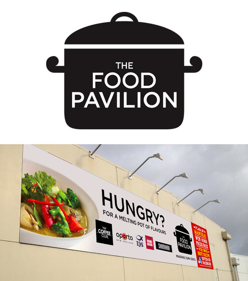
Shopping Mall Branding for the new Food Pavilion at Manukau Supa Centa.

Duffy created a new identity for the Manukau Supa Centa eatery, the brief to create an identity that reflected the melting pot of flavours at the Pavilion. Duffy also created the campaign graphics for the Flava of Manukau best recipe competition.

Wayfinding Signage Design – Manukau Supa Centre Food Pavilion

Wednesday, December 19th, 2012

wayfinding signage foodcourt amenities manukau supa centa duffy design

Wayfinding Signage Manukau Supa Centa Custom Wallpaper Design Duffy Design

Wayfinding Signage Manukau Supa Centa Wallpaper Design Duffy Design

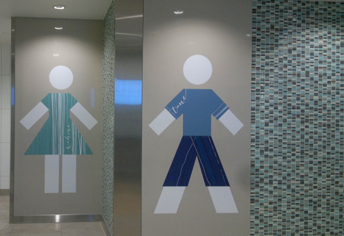
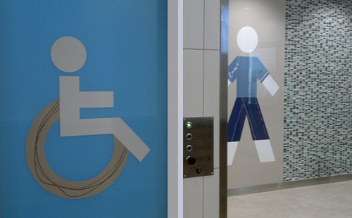
Wayfinding signage design for the amenities at the new Food Pavilion at Manukau Supa Centa has just been completed by Duffy Design.

The design comprising of a 7 metre custom wallpaper design based around a Maori inspired koru design, fused with typography themed around terms relating to Manukau and New Zealand.

This pattern was also applied to the Mens, Womens, Baby and Disabled icons.

Shop Branding & Window Graphics – The Rub Broadway Newmarket Auckland

Wednesday, December 19th, 2012


Shop Branding Auckland The Rub Broadway Newmarket Rialto Entrance Duffy Design

Shop Branding Auckland The Rub Broadway Newmarket Rialto Entrance Duffy Design

Shop Branding Auckland The Rub Broadway Newmarket Duffy Design

Shop Branding Auckland The Rub Broadway Newmarket Lightbox Design Duffy Design

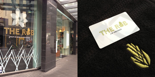
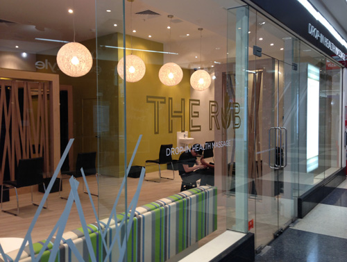
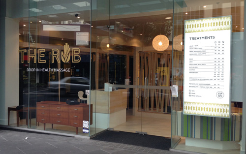
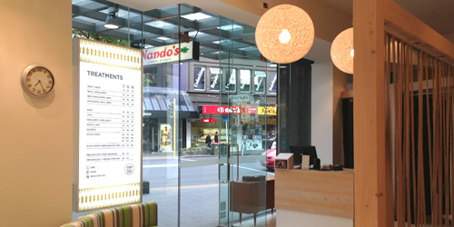
Shop branding and Window Graphics by Duffy for The Rub.

The Rub, a stunning new Drop-in Health Massage addition to Broadway, Newmarket.

Duffy designed the logo design, loyalty cards, lightboxes and window graphics. The brand identity, a fusion of a ‘tree’ design that was worked through from the Interior Design linking the woven hessian panels with the tree pattern on the windows, lightbox and in the hand shape in the ‘u’ of Rub. A fun project!

“Belinda understands the importance of retail branding in drawing customers in to our store.
She delivered a brand that was fresh and original, while incorporating well with our store fitout.
The brand, original pattern and graphic elements for our store windows and print material are fantastic. Above all they work for us everyday.” Chris Burt, Owner.

Wall Graphics – Bayfair Shopping Mall Tauranga

Tuesday, September 4th, 2012

Wall Art Graphics Bayfair Shopping Centre Parents Room Duffy Design Auckland

Wall Graphics Bayfair Shopping Centre Parents Room Duffy Design

Wall Graphics Bayfair Shopping Centre Parents Room Duffy Design Auckland

Custom Mural Design Bayfair Shopping Centre Duffy Design


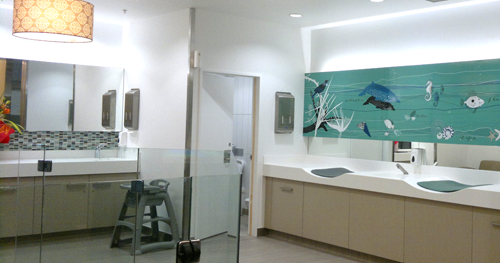
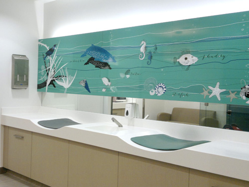
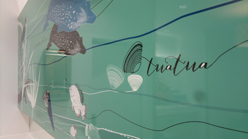
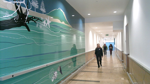
Duffy has just completed the custom designed wall graphics for the mural at the entrance to the Amenities and the custom wallpaper above the nappy change area inside the Parents Room at Bayfair Shopping Centre hot up on the walls last Tuesday!

“The parents’ room and amenities upgrade has set new standards in design in the region-Incorporating graphic’s that show case the regions iconic images, The new facilities are a refreshing addition to the Bayfair retail mix and show case innovative design that provides function, great aesthetics and unique sustainable green features. Since the opening the new facilities have been heavily used with continued positive feed back for the users on how great the facilities are” Steve Ellingford, Centre Manager, AMP Capital

Wayfinding Signage Design – Bayfair Shopping Mall Tauranga

Tuesday, September 4th, 2012

Wayfinding Signage Design Bayfair Shopping Centre Duffy Design

Wayfinding Graphics Bayfair Shopping Centre Duffy Design

Duffy has just completed some the wayfinding signage for the Amenities and Parents Room at Bayfair Shopping Centre hot up on the walls last Tuesday!

“The parents’ room and amenities upgrade has set new standards in design in the region-Incorporating graphic’s that show case the regions iconic images, The new facilities are a refreshing addition to the Bayfair retail mix and show case innovative design that provides function, great aesthetics and unique sustainable green features. Since the opening the new facilities have been heavily used with continued positive feed back for the users on how great the facilities are” Steve Ellingford, Centre Manager, AMP Capital

Interior Design Website Design – Alizarin

Thursday, March 3rd, 2011

Interior Design Website Design Alizarin

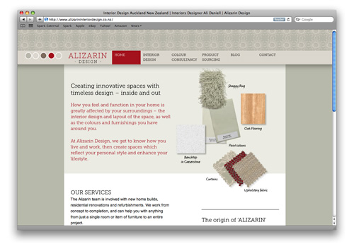
Hot off the Duffy cutting room table – a new website for Alizarin Interior Design.

The web design creative is based on the idea of fabric selvages, with each page of the site having it’s own unique colour scheme.

A true reflection of Ali Daniel from Alizarin’s prowess, developing colours schemes and interiors designed, from the benchtop to the roof colour all working in harmony.

“I approached Belinda Duffy of Duffy Design to design my new website after viewing her creative and diverse portfolio.

My brief to Belinda was for a visually appealing, informative and functional website. During our initial discussion she suggested using images as well as text to show how each aspect of the design process works, and also how colour and fabrics could be used as a repeating theme on each web page to reflect the nature of my business. These were both original ideas which evolved further as the website was developed.

Belinda communicated with me on a regular basis, ensuring that I was happy with each page design. Nothing was too much trouble – she was incredibly patient with all the minor tweaks and time required to get the web pages perfect before the site went live; never once losing her sense of humour! It has been a most rewarding journey to see the website come to fruition.

I am delighted with the end result which is a testament to her creative flair, attention to detail and professional approach.” Ali Daniell.

www.alizarininteriordesign.co.nz
Logo and Website for Dece Design – Interior Designer Wanda Szychowska

Thursday, February 10th, 2011

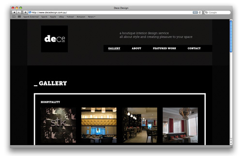
Logo and Website Design - Dece Design Interior Design
The Brief:
“I see my style as ‘edgy elegance’ and need this translated into a logo”
” ‘Dece’ stands for design that is edgy, contemporary (cool) and european.”

The result a strong graphic design across her cards and site that sits well with Wanda’s interior design style.

www.decedesign.com.au