HABITAT CAFE
Hospital Cafeteria Branding with a Leafy Twist
NEW TO AUCKLAND’S NORTH SHORE: HOSPITAL CAFETERIA BRANDING FOR HABITAT WITH A LOVELY NATURAL AUTUMN LEAFY DESIGN.
How many times have you heard someone say ‘I just love visiting the hospital! The linoleum, the chipped cream walls, the delicious smell of antiseptic, I just love it here!’ Right. Well, that was Duffy’s mission in a nutshell: to create a desirable space in a less-than-desirable location. Where do you dream of being when you’re trapped indoors, feeling a little (or a lot) unwell? Where does your mind take you when it needs release, freedom, happiness and light? To the outdoors of course, the green, woody, light-dappled expanses of our childhoods. And that is precisely what Duffy set about to create. The interior design for ‘Habitat’ already featured loads of natural wood and a distinctive leaf abstract, so building on these strong elements Duffy set about designing the branding and collateral to match.
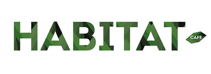
Starting with the logo design, a close palette of green tones was selected and used in conjunction with the leaf pattern which was then placed inside the words HABITAT. Filling typography with pattern isn’t often done, and this is where Duffy got a little excited. To be able to run with her ideas and have them work so well on the exterior wood panelling had Duffy fairly beaming with pride: and the overall effect had people talking across the wards. What Duffy had captured was a feeling of leafy freedom in a necessarily sterile environment, while still keeping an aura of chic sophistication across the branding profile. Cool, calm, fresh and natural – not an easy look to pull off!
The ‘open’ and ‘closed’ signs continued on with the distinctive leaf outer shape, with a reversible sign that worked with the white vinyl hours text on the window. See? Duffy really does think of everything!
Large TV’s were used for the menus which were also laid out by Duffy, along with food price tags and custom-designed hand-out DLE menus. As an extra touch, Duffy whipped up a batch of Microsoft Word templates, making it easy for the hospital café management to keep all signage in brand and at hand.
Another satisfied customer, another job well done, another large cappuccino to celebrate!
HOSPITAL CAFETERIA BRANDING


