NZ ORTHOPAEDIC CO
Interior graphics to get your team moving
ONE OF NEW ZEALAND’S LEADING ORTHOPAEDIC AND NEURO COMPANIES NEEDED TO ADD SOME INTERIOR GRAPHICS TO THEIR NEW OFFICES. THEMES OF ‘MOVEMENT & MOTION’ AND BEING ‘PROUDLY KIWI’ WERE FUSED INTO THE DESIGN OF THEIR INTERIOR GRAPHICS.
Boy did Duffy get down and funky with this one. With only a floor plan in hand, Duffy set about designing the interior graphics and design for this energetic company, thinking outside of the box at every turn. The theme? ‘Kiwis on the go’. A fair amount of leeway was given to Duffy on this one – Duffy was simply told to make the space sing – and Duffy went ahead and created an Opera performance! Rather than providing a flat, static set of images (which would have been easy enough, let’s face it) Duffy got down on her knees and consulted with her inner fitness fanatic. She had to search long and hard, but she finally found sporty Duffy dressed head-to-toe in fluoro lycra, downing a macrobiotic smoothie, and after joining her on the yoga mat for a few hours, Duffy came away inspired.
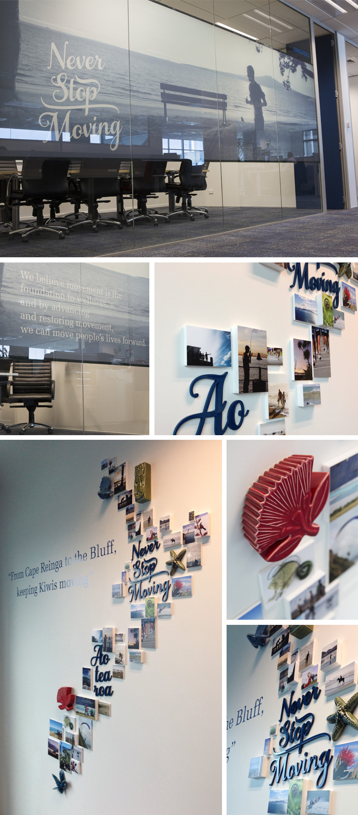
To truly capture the Kiwi idea of movement and motion, Duffy had to incorporate some quirky elements – including a custom-designed artwork comprised of different height blocks mounted with images of people ‘moving’ throughout New Zealand. Each block was geographically chosen to sit in the right spot in the country, entwined with a selection of ceramic art pieces and cut text. With their byline ‘Never Stop Moving’, and the word ‘Aotearoa’ both artistically placed within the visual map of NZ, the message was clear for all to see. To make sure no one missed the point, however, Duffy supported the entire piece with a byline specially created by Duffy (with some assistance from her sporty twin) to support this concept of uniquely Kiwi physical health: ‘From Cape Reinga to the Bluff, keeping Kiwis moving’.
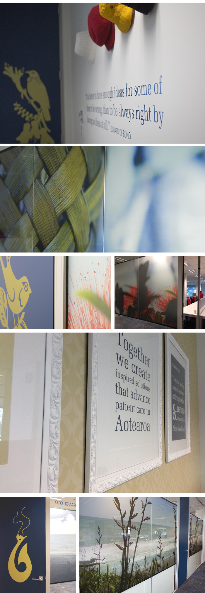
The large glass office walls were also printed with stunning images of New Zealand, their boardroom featuring a runner at dawn with Rangitoto in the background to give a sense of place. All of the inside of doors also featured hand illustrated and cut images of Tuis, Kina, Pohutakawa and of course the traditional Maori fish hook.
The company values were typographically designed and displayed in ornate frames with a custom wallpaper designed by Duffy using their logo.
It might not have been an Olympic event, but we still think the gold goes to Duffy on this one!
OFFICE INTERIOR GRAPHICS


