SPORT WAITAKERE
New logo design for Waitakere’s sporting community
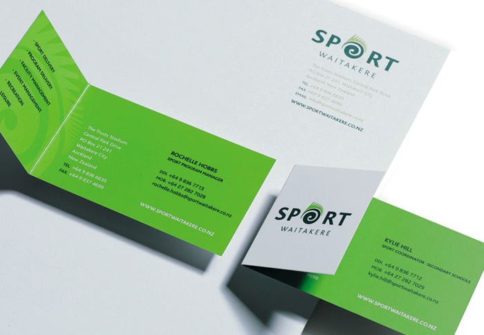
SPORT WAITAKERE, A NOT FOR PROFIT REGIONAL SPORTS TRUST, NEEDED A NEW LOGO DESIGN.
This community organisation that helps create and maintain a healthy and active well being for West Aucklanders needed their new community brand to be visually inclusive of all sports and to have a Waitakere feel.
Their previous logo design featuring the ‘running man’ was busy and difficult to use in it’s tall proportions, the new logo design needed to be bolder and clearer and in better proportions.
With their new offices inside the just build Trusts Stadium at the foothills of the Waitakere Ranges, the new logo design needed to reflect it’s location. This was achieved in the new logo design using the round O of ‘Sport’ as a koru with a fern on it’s outer edge.
The colour palette was comprised of two tones of green, that worked well when applied to building signage, their silver fleet of vehicles on event signage and on a multitude of event flyers that continue to feature this much seen brand.
BRAND IDENTITY
![]()
STATIONERY DESIGN