SUZANNE TURLEY LANDSCAPES
Landscapes Logo for Auckland’s very best
SUZANNE TURLEY LANDSCAPES NEEDED A FRESH LOGO TO ALIGN WITH THE CALIBRE OF THEIR LEADING WORK.
Suzanne Turley had formerly branded her business as STL, but felt it was time to move away from this abbreviation as a visual identity. Yes it was short and snappy – but as a descriptor for her business, it really wasn’t doing the trick. Suzanne brought Duffy on board to trim back the overgrowth and let the flowers through: her main mission was to create a brand that would visually capture the quality of Suzanne’s green-fingered brilliance. With this in mind, Duffy took off her shoes, grabbed her coffee and headed out into her garden. Hidden among her tangle of weeds,her less-than-impressive patch of brown grass and her bed of wilted daisies, Duffy found a vibrant new growth of inspiration – and before long, Duffy was in full design mode.
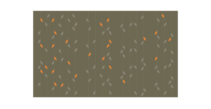
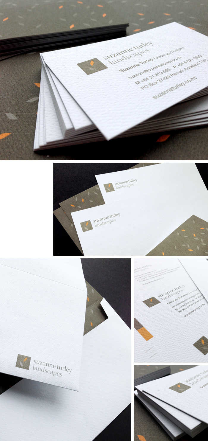
On the back of her successful garden interlude, Duffy developed a range of logo design concepts, working with an abstract pattern design that became their brand icon – not to mention a stunning feature on the back of their letterheads and business cards.
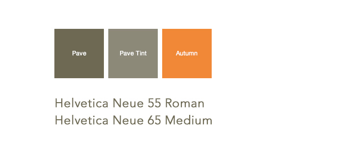
The colours for their branding were carefully hand-selected to exude the sophistication of their work while also showcasing the complex hues of nature herself.
A top quality Mohawk letterhead paper stock with a stunning tactile finish was also used to further enhance their brand giving a sense of growth and living nature to a brand that is sure to grow, and grow, and GROW!
If only some of that growing would rub off on Duffy’s garden…
LOGO DESIGN

COLOUR PALETTE & FONTS

PATTERN DESIGN

STATIONERY DESIGN

