CHIRO PRACTIC SYNERGY
Brand Identity Design for Chiropractic Clinic
DUFFY DESIGN HAS MOVED A CHIRO CLINIC FROM A MID 1980’s LOGO TO A MODERN AND APPEALING BRAND IDENTITY FOR 2015 – WELCOME CHIRO PRACTIC SYNERGY.
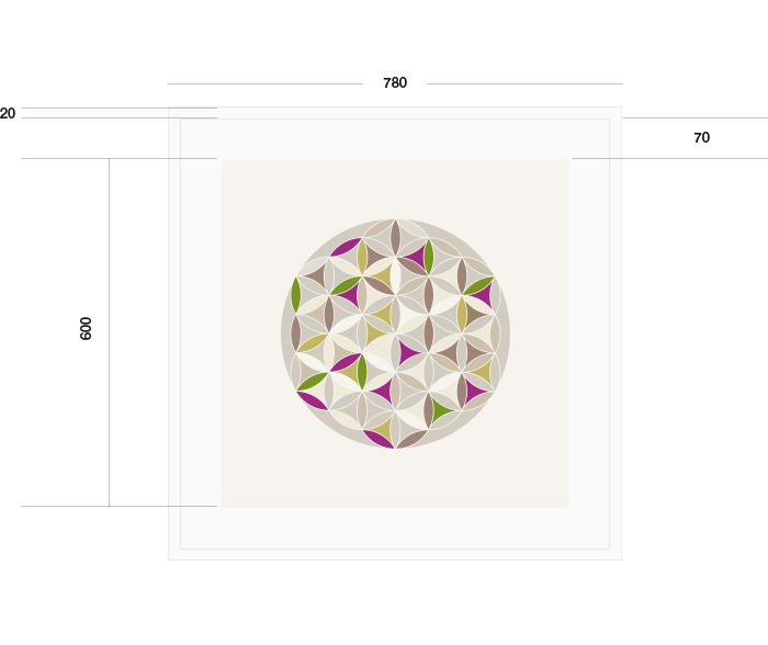
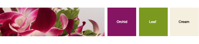
The essence of the design was sparked by two things. Firstly, the clinic’s favourite reception bloom, the orchid and secondly the symbol of life. Together these reflect alignment of both body and mind. The natural colours taken straight from the orchid immediately ground the brand identity into nature and into synergy.
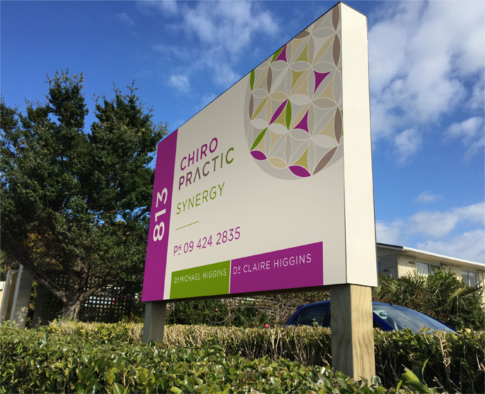
The practicalities influencing the design included a requirement for strong signage. The location of the clinic is on a busy road and the clinic was not only loosing potential new word of mouth business, but regulars were overshooting the entrance.
The response from Duffy Design was simple sign. The new sign clearly states the number of the road (as many people scan for the number before they look for the name of the business), and the name and logo. Their phone number was added, for attracting new business.
The Dr’s and Duffy Design had some fun with the branding in the reception, taking the circle of life and creating a large framed print. This reminds everyone the importance of living a healthy balanced life.
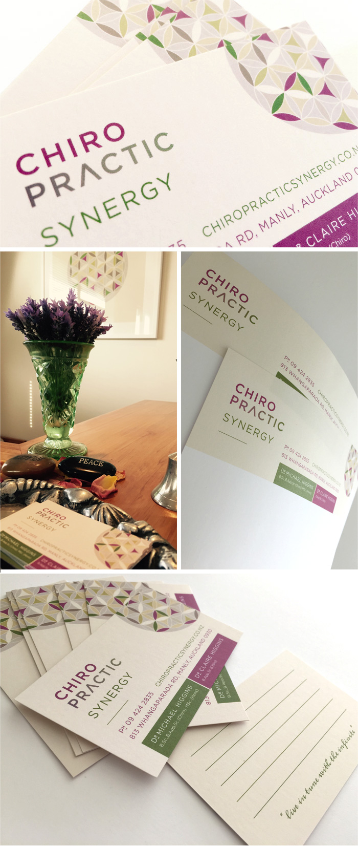
Flowing the new look through the stationery completed the new look and feel.
For regular “coasties” dropping in for their tune up, the new look inspires and makes them feel right at home.
LOGO DESIGN
![]()
COLOUR PALETTE
CLINIC SIGNAGE
STATIONERY DESIGN
FRAMED ART BRANDING