PANI PURI
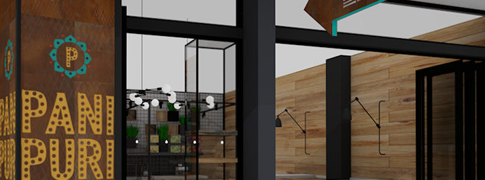
Restaurant Branding for New Zealand’s first Indian Street Food GETTING THE STREET FOOD FEELING ACROSS IN A MALL ENVIRONMENT WITH STRICT RULES AROUND VISUALS, EQUALLED SOME VERY CREATIVE THINKING. While there are many Indian restaurants and takeaways across New Zealand, this is the first in the street food style and also the First Indian street food to […]
NZ ORTHOPAEDIC CO

Interior graphics to get your team moving ONE OF NEW ZEALAND’S LEADING ORTHOPAEDIC AND NEURO COMPANIES NEEDED TO ADD SOME INTERIOR GRAPHICS TO THEIR NEW OFFICES. THEMES OF ‘MOVEMENT & MOTION’ AND BEING ‘PROUDLY KIWI’ WERE FUSED INTO THE DESIGN OF THEIR INTERIOR GRAPHICS. Boy did Duffy get down and funky with this one. With […]
SUZANNE TURLEY LANDSCAPES
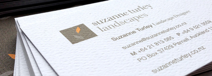
Landscapes Logo for Auckland’s very best SUZANNE TURLEY LANDSCAPES NEEDED A FRESH LOGO TO ALIGN WITH THE CALIBRE OF THEIR LEADING WORK. Suzanne Turley had formerly branded her business as STL, but felt it was time to move away from this abbreviation as a visual identity. Yes it was short and snappy – but as […]
ABODO WOOD
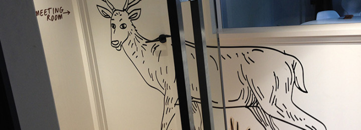
Office wall art that really speaks out FUN, FUNKY OFFICE WALL ART WAS THE ORDER OF THE DAY FOR ABODO WOOD’S NEW OFFICES IN PARNELL – TO INJECT THEIR QUIRKY BRAND PERSONALITY INTO THEIR WORK ENVIRONMENT. As many of her clients already know, Duffy has an unusual sense of humour. The kind of unusual that […]
BY DESIGN
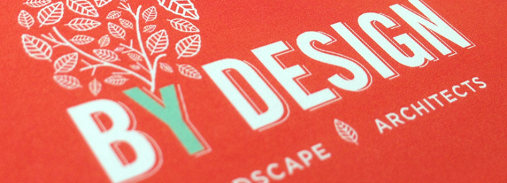
Landscape architect logo design with a refreshingly different colour palette AUCKLAND LANDSCAPE ARCHITECT JANE MCGUFFIE FROM BYDESIGN WANTED TO MODERNISE HER COMPANY BRANDING. THE BRIEF WAS TO MAKE THE LOGO LOOK A LITTLE BIT RETRO AND TO PUSH OUTSIDE THE TRADITIONAL GREEN COLOUR PALETTE OF THE MAJORITY OF LANDSCAPE COMPANIES. Duffy worked through the day […]
HOUSE OF NAUTICA
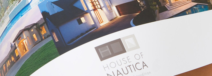
Company rebrand for House of Nautica HOUSE OF NAUTICA BASED IN AUCKLAND NEW ZEALAND NEEDED A COMPANY REBRAND TO RAISE THE CALIBRE OF THEIR BRAND TO ALIGN WITH THEIR AWARD-WINNING MULTI-MILLION DOLLAR MASONRY HOMES THEY BUILD. They called upon Duffy to work on their company rebranding, new logo redesign, marketing collateral design and their new […]
PIPELINE & CIVIL
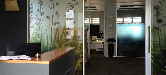
Office Interior Graphics weaves team together PIPELINE AND CIVIL BUILT THEIR BRAND NEW OFFICE AT THE FOOTHILLS OF AUCKLAND’S WAITAKERE RANGES. THEY NEEDED BOLD AND EYE CATCHING OFFICE INTERIOR GRAPHICS TO WEAVE THROUGH A THEME OF TOGETHERNESS FOR THEIR TEAM OF EMPLOYEES, ALL STAKE HOLDERS AND AMBASSADORS OF PIPELINES BRAND. The interior graphics were designed […]
HADYN & ROLLETT
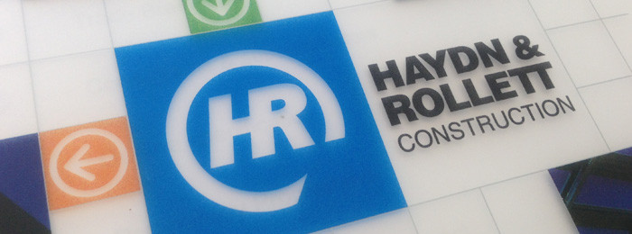
Proposal design with wow factor CONSTRUCTION COMPANY HADYN & ROLLETT BASED IN AUCKLAND, NEW ZEALAND WANTED THEIR PROPOSAL DESIGN TO BE IMPRESSIVE AND EASY FOR THEM TO PRODUCE. Duffy set to work on the tender design comprised of proposal covers, tabs and inner Word templates, pushing Word as far as possible. A translucent proposal design […]
ASPEC CONSTRUCTION
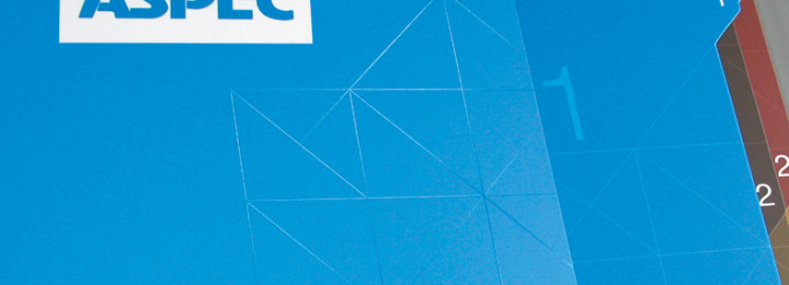
Modernising of brand identity across website, proposal, template and interior design. DUFFY DESIGN WAS BOUGHT ON BOARD TO REFRESH AND MODERNISE THE BRAND DESIGN OF ASPEC, ONE OF NEW ZEALAND’S LEADING COMMERCIAL CONSTRUCTION COMPANIES. IN THIS INDUSTRY WORK IS OFTEN WON THROUGH A TENDERING PROCESS, SO THE LOOK AND FEEL NEEDED TO BE BANG-ON. Duffy […]
GRAYSON ENGINEERING
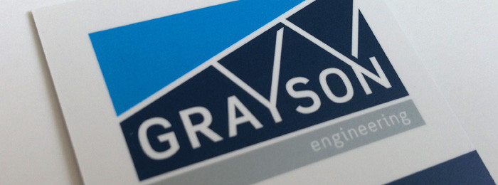
Logo for construction company thoroughly reflects Grayson NEW LOGO FOR CONSTRUCTION COMPANY GRAYSON MARKET LEADERS IN STEEL CONTRUCTION IN NEW ZEALAND. Their former 35yr ‘cog’ business logo design just didn’t represent this impressive company. Duffy’s process to create the new logo design for construction company Grayson involved a real investigation into the common shapes and patterns […]
ARCHITECTURE SMITH + SCULLY
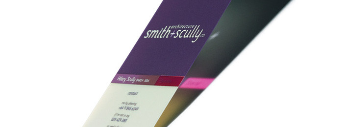
Architecture branding shows personality plus INNOVATIVE ARCHITECTURE FIRM, SMITH AND SCULLY AND DUFFY HAVE A WORKING HISTORY TOGETHER. DUFFY HAD DONE THEIR ORIGINAL WEBSITE, AND NOW WAS CALLED BACK TO REBRAND AND FLOW THIS THROUGH TO A NEW WEBSITE. One of the features of Carolyn Smith and Hilary Scully is their personalised approach. This is […]
CLIMATE COATINGS
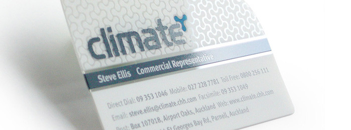
Memorable business cards for reps on the road NEW ZEALAND COMPANY CLIMATE LEADERS IN POWDER-COATING FOR COMMERCIAL AND RESIDENTIAL CONSTRUCTION NEEDED MEMORABLE BUSINESS CARDS THAT WOULD BE REMEMBERED WHEN THEIR REPS VISITED VISUALLY ASTUTE, ARCHITECTS AND INTERIOR DESIGNERS. Climate Coatings discovered Duffy following reading an article about the success of another client with Clear Business […]
CRAGGY RANGE
Property branding for exclusive Tukituki subdivision CARTER HOLT HARVEY APPROACHED DUFFY TO CREATE PROPERTY BRANDING FOR A LIFESTYLE LAND SUBDIVISION IN HAVELOCK NORTH, NEW ZEALAND OVERLOOKING THE TUKITUKI RIVER AND TE MATA PEAK. The challenge with this project was that the entire area was still pine forest making it impossible for us to photograph the […]
FIVE MILE
Property development logo for eco-friendly development PROPERTY DEVELOPMENT LOGO DESIGN FOR FIVE MILE, QUEENSTOWN ONE OF NEW ZEALAND’S FIRST SUSTAINABLE AND CARBON NEUTRAL LAND DEVELOPMENTS. Duffy created a range of logo concepts for New Zealand’s first sustainable and carbon neutral development, the $2 billion Five Mile Township project in Queenstown. The property development was to […]
BEECHNEST
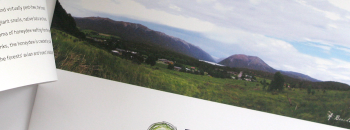
Property brochure design & branding for nature lovers BEECHNEST IS A NEW PROPERTY DEVELOPMENT IN ST ARNAUD, ON THE SHORES OF LAKE ROTOITI AND AT THE GATES OF THE NELSON LAKES NATIONAL PARK. PROPERTY VENTURES SECURED THE SMALL AMOUNT OF DEVELOPMENT AVAILABLE TO THE AREA. HAVING WORKED WITH DUFFY DESIGN ON TWO PREVIOUS PROPERTY VENTURES, […]
SYDENHAM SQUARE
Housing development logo reflects inner-city living PROPERTY VENTURES SYDENHAM SQUARE BASED IN CHRISTCHURCH, NEW ZEALAND NEEDED A HOUSING DEVELOPMENT LOGO AND WORKED WITH DUFFY TO CREATE ONE. With Sydenham’s goal to create a community of like-minded people living in close proximity the mosaic had a great visual relationship. Sydenham Square is a mixed development of residential, […]
WIRI TIMBER

Corporate brochure design allows Wiri Timber’s professionalism to shine through WIRI TIMBER APPROACHED DUFFY TO CREATE A CORPORATE BROCHURE THAT COULD BE USED TO SEND TO DISTRIBUTORS AND NEW CLIENTS The brochure needed to express what they were about, their approach and what sets them apart from the conglomerates of the NZ Timber industry such as […]
SOLID FLOORS

Company rebranding lifts team morale COMPANY REBRANDING FOR SOLID FLOORS A CONCRETE GRINDING AND FINISHING COMPANY TO POSITION THEM AS THE BEST AND MOST DESIRABLE IN THE INDUSTRY. Like many small businesses in New Zealand branding is often misunderstood. Solid Floors thought branding was just for the big guys, until they realised what a professional […]
ONE TO ONE HUNDRED
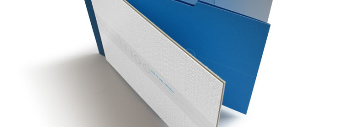
Custom logo design for Auckland 3D visualisation company STARTUP ARCHITECTURAL VISUALISATION FIRM ONE TO ONE HUNDRED CAME TO DUFFY FOR A CUSTOM LOGO DESIGN. THEY ALSO REQUIRED A STUNNING PORTFOLIO CASE TO HOUSE THEIR SHOWREEL AND ACCOMPANYING INFORMATION ABOUT THEIR 3D RENDERING SERVICES TO DIRECT MAIL FOR ARCHITECTS AND PROPERTY DEVELOPERS. The custom logo design […]
