BY DESIGN
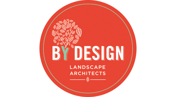
Landscape architect logo design with a refreshingly different colour palette
AUCKLAND LANDSCAPE ARCHITECT JANE MCGUFFIE FROM BYDESIGN WANTED TO MODERNISE HER COMPANY BRANDING. THE BRIEF WAS TO MAKE THE LOGO LOOK A LITTLE BIT RETRO AND TO PUSH OUTSIDE THE TRADITIONAL GREEN COLOUR PALETTE OF THE MAJORITY OF LANDSCAPE COMPANIES.
Duffy worked through the day and night for this project, channeling her inner green goddess with a process of meditation, whole foods and dress ups. Although Duffy found typing in gardening gloves a slight challenge, it did open her creative gates: and the results? A truly fantastic logo design for a truly unique landscape architect.Duffy experimented with a range of logo directions before settling on a design that integrated the ByDesign logo text with a simple leaf shape. Duffy repeated this shape, and used it to form a tree using the Y of the logo text as the trunk. Pure brilliance!
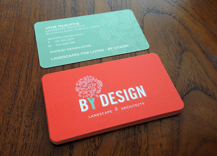
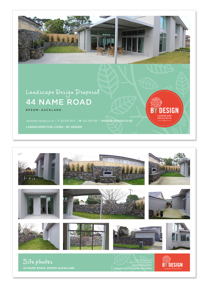
The logo was designed to be used either in a circle or on the orange solid background depending on the collateral. Duffy designed Business Cards, Presentation and Drawing templates and electronic email and letterhead layouts; just to complete the offering.
LANDSCAPE ARCHITECT LOGO DESIGN

BUSINESS CARD DESIGN

PRESENTATION TEMPLATES

CLIENT TESTIMONIAL
“I highly recommend Belinda at Duffy Design. Belinda created my new logo and branding. She was amazing – fast, friendly, and extremely patient with all my questions. I found she listened well to my design brief and responded with fresh ideas. I am very happy with the result – huge thanks Belinda!!”
