PANI PURI
Restaurant Branding for New Zealand’s first Indian Street Food
GETTING THE STREET FOOD FEELING ACROSS IN A MALL ENVIRONMENT WITH STRICT RULES AROUND VISUALS, EQUALLED SOME VERY CREATIVE THINKING.
While there are many Indian restaurants and takeaways across New Zealand, this is the first in the street food style and also the First Indian street food to open in a mall. Originally the concept direction was a juice bar. However in discussion with the client and understanding the client’s offerings it became apparent that they were something quite different!
The client came into the project with a brand and collateral that didn’t work for the Kiwi market. Duffy’s job was to work with them to come up with a name that would work graphically and would be easy to spell and say. Pani Puri, the name of the signature dish was memorable and it was culturally sensitive.
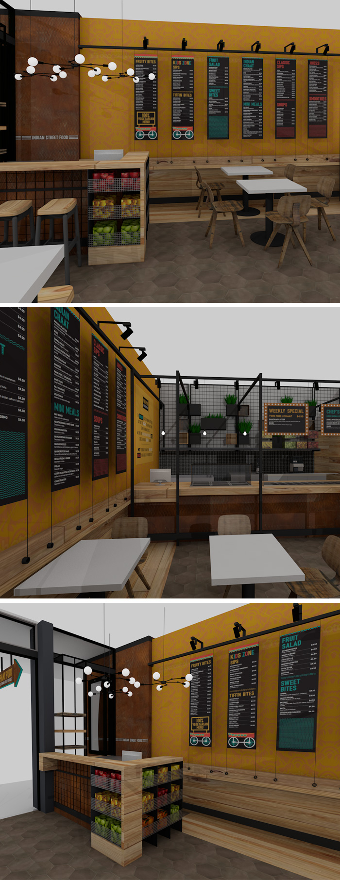
The look and feel was required to stand out, but in an authentic way. The Indian street cart vendors inspired the colour palette for the brand – vibrant orange, yellow and green. A little street cart icon was incorporated into the menus.
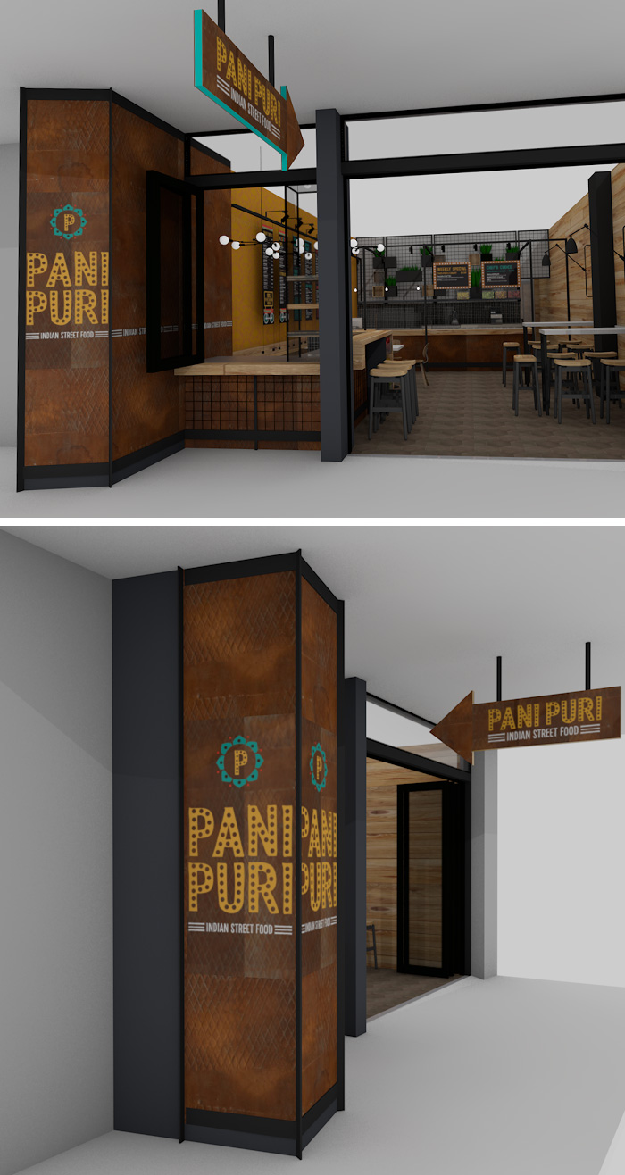
Duffy worked closely with the Botany Town Centre management to make sure the branding was going to be on brief and work in their malls. Each element needed to meet their strict quality criteria.
Working in close collaboration with interior design company, Godward Design, Pani Puri used rustic geometric copper panels and edison filament lighting with some quirky spider lights. These, combined with the metal mesh panels and baskets that display fresh fruit and plants, bring a natural feel to the street edge.
RESTAURANT BRANDING & SIGNAGE DESIGN

RESTAURANT MENU DESIGN

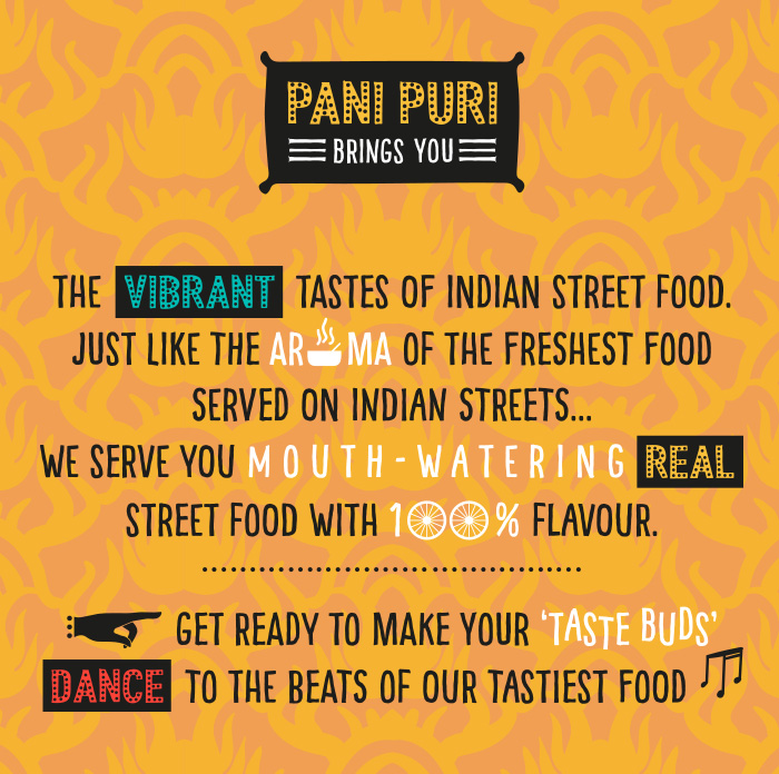
RESTAURANT BRAND STORY WALL GRAPHICS

