GOODNESS THERAPY
Retail brand design crosses cultural aesthetics
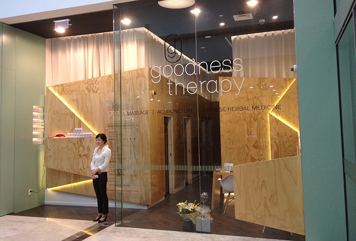
GOODNESS THERAPY APPROACHED DUFFY DESIGN TO CREATE A RETAIL BRAND DESIGN FOR THEIR NEW BOTANY STORE. THE BRAND DESIGN NEEDED TO APPEAL TO BOTH THEIR ASIAN AND EUROPEAN CLIENTS, AND THE BRAND WAS TO BE IN A RESTRICTED COLOUR PALETTE OF BLACK AND WHITE.
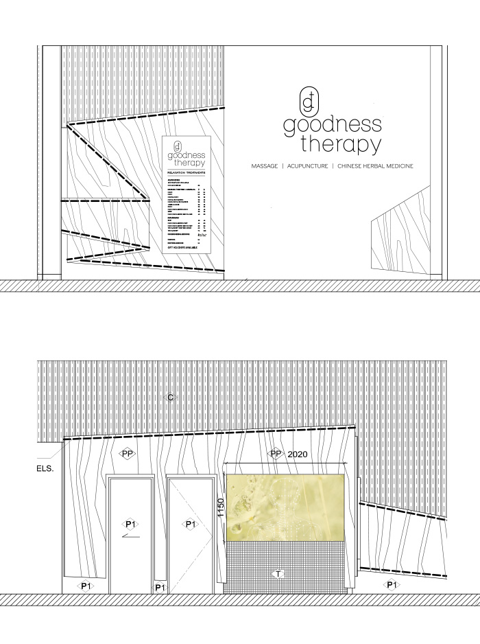
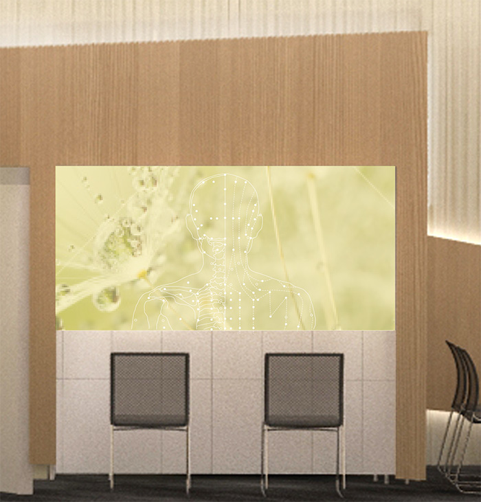
Duffy created a retail brand design that was stunningly neutral. Colour was bought into store interior with a wall panel depicting the acupuncture points across the body. The wall panel rests behind the waiting chairs and brings not only colour but a sense of warmth, welcome and knowledge.
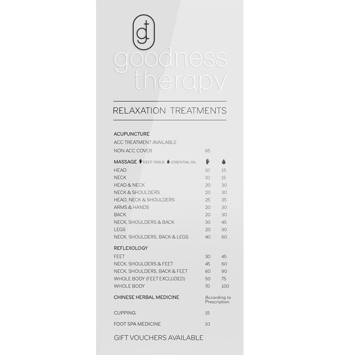
Duffy also created other parts of the overall look and feel of the store, including laying out treatments and the price list.
RETAIL BRANDING

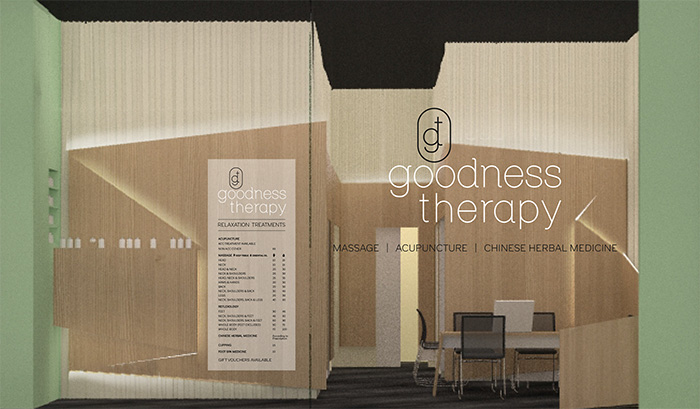
SHOPPING MALL STORE WINDOW BRANDING
MENU BOARD DESIGN
