Food Logo Design for Raw Food Store - Rawlicious
Food Logo Design for Raw Food Store – Rawlicious
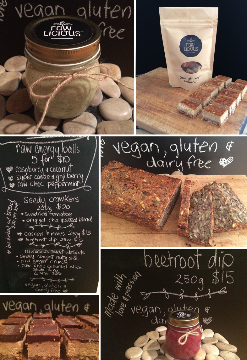
Heaps of fun helping out raw food chef, Maz Jones with her new Rawlicious food logo design for her new business.
A simple logo design with a lovely organic feel featuring a sprout within the logo text – the key to the goodness of eating raw food!
The brief was to design the logo to be able to be applied with a rubber stamp to brown bags, hence simplicity and contrast was key and the stamp look worked well to achieve an environmentally friendly food packaging look. Classy black satin-finish freezer-grade food labels were also designed to brand the lids of her raw food products in jars.
Soul food made with love and passion!
Watch this brand grow I say..
Food Packaging for Nuts Company – Nuttz
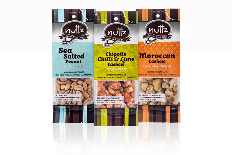
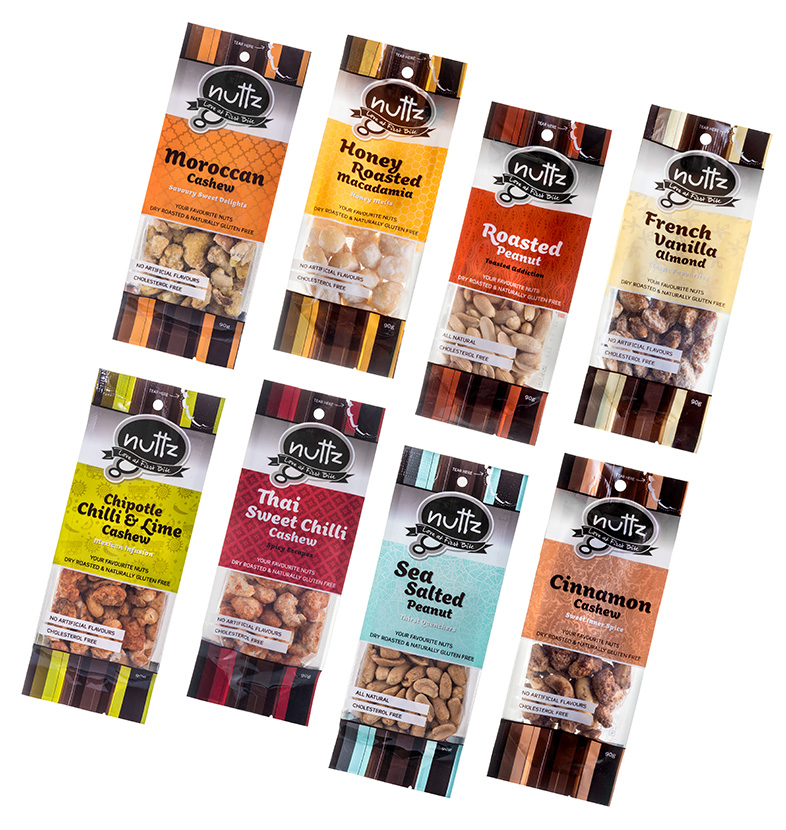
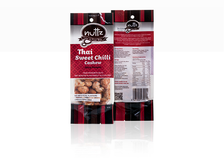 Nuttz new Food packaging has hit the shelves – a Mark III for Duffy – so exciting to be able to use some colours.
The previous packs were struggling to stand on the shelf, so to get the market ‘seeing’ them it was time to add some colour.
Had a ball designing these packs designing the most relevant colour palettes and patterns to work with the ethnicity of the flavours and or the flavours themselves!
These packs are still just 2 colours + white – I just love a challenge, but a challenge that saves my clients money is worth it.http://duffy.co.nz/food-packaging-nuts-company-nuttz/
Photographer Website Design – Michelle Moir
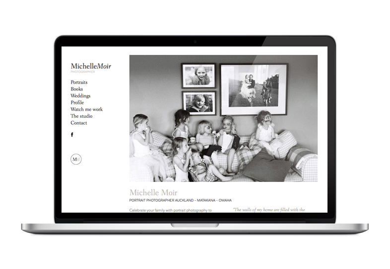 Photographer website design by Duffy for Auckland Portrait Photographer Michelle Moir, a stunningly simple portfolio website showcasing her impressive Black and White portraits.
Duffy developed her new brand identity, stunning business cards, html email launch and promotional graphics and gift vouchers.
WordPress website – Castabroad Fly Fishing Holidays
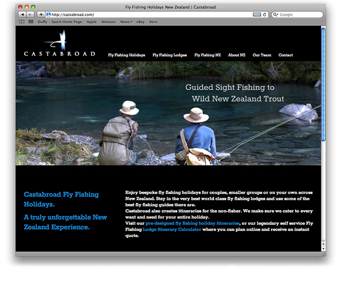
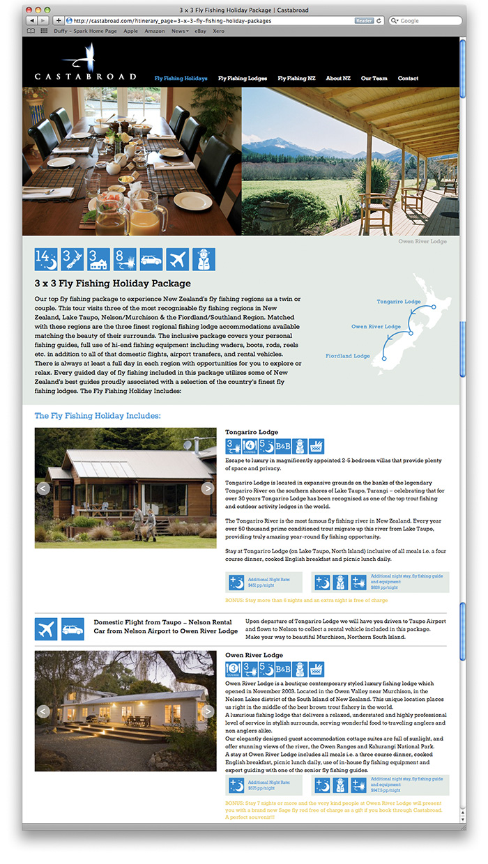
Castabroad’s WordPress website has just gone live!
When Craig from Castabroad came to Duffy he had a great lovely brand identity, outstanding imagery but needed the Duffy design website design glue to make his fly fishing tours business really communicate and stand proud.
The first step in the evolution of the new Castabroad site required some wireframe planning distilling his itineraries and previous site content until there was an ‘aha’ moment where I really felt I understood what his offer was and we had some order.
From there the site grew through the design execution and development process and of course adding a few bells and whistles along the path.
“Duffy made its introduction and first grabbed our attention through a website they had previously designed www.theboatshed.co.nz. The site was clean, easy to navigate and had set a level of credibility to match the service it was advertising, which became the mantra of the project in creating Castabroad’s now live and functional tool – www.castabroad.com
From first contact, ideas & expectations were quickly extracted from us by Belinda and a brief was drawn up. From there the project grew as we were introduced to options that could be integrated into the website, and before we knew it Belinda had designed what we believe to be the best NZ resource for what we do.
A customised and very sophisticated (behind the scenes) calculator proves for simple online enquiries to be quoted in real time exchange rates to the visitor.
Imagery, being the most important facet of online advertising was maximised with wall to wall panoramas of our incredible NZ scenes shown in a slideshow, different on every page. No need for a gallery page here – the whole site is a hi-res gallery!
The CMS used is WordPress, simple to use and available on any platform – whether we want to update something from our offices in Wanaka or even an iPhone on the riverbank, we can.
Timing is everything, and Duffy Design was flexible to our availability during busy spells in our offices and we simply picked up and carried on when we could.
Open and transparent quotations, the best of design talent, fair and honest opinions and fulfilling expectations is a given with Duffy Design – Highly recommended, in fact we have already recommended Duffy Design.”
Craig Somerville, Managing Director of Castabroad
www.castabroad.comhttp://duffy.co.nz/wordpress-website-castabroad-fly-fishing-holidays/
Batch Winery Waiheke Island – Wine Label Design
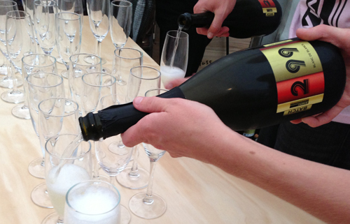
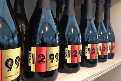
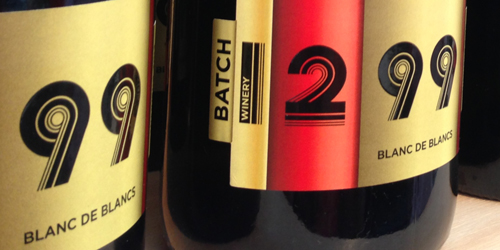
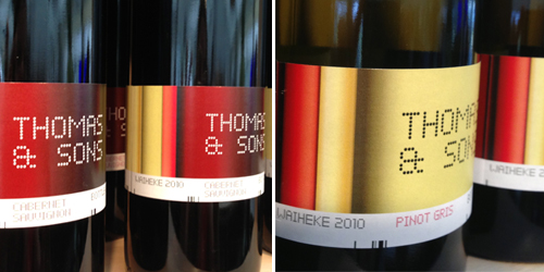
Batch Winery Waiheke Island – Wine Label Design by Duffy Design
Batch Winery 1299 Blanc de Blancs being served at the Sculpture on the Gulf opening, and the premium range Thomas & Sons.
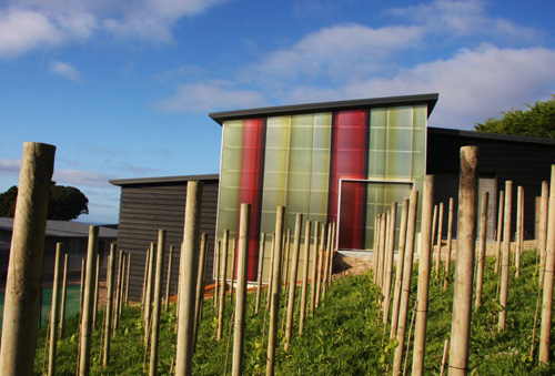
Duffy worked with leading designer David Scott who designed the Batch Winery building, Duffy created the coloured panels that adorn the exterior walls of the winery, the colours inspired by the colours of wine from pale lemon lime (Pinot Gris) to Rose to Deep Plum (Merlot).
Batch Winery is one of New Zealand’s first gravity-fed wineries allowing hand-picked grapes to be delivered at the top level then naturally wine feeds into tanks and aged wines into the barrel hall built into the hillside.
The name Batch reflecting the care, attention and uniqueness of each ‘Batch’ of wine it produces.
All of the Batch Winery labels feature the same wine colour ‘stripes’ to connect them with the Art in the Vineyard, the exterior of the winery.
The Batch labels are all uniquely numbered for each type of wine using a custom designed font by Duffy which is comprised of lines in varying weights to mimic barcoding.
The Thomas and Sons label, Batch Wineries premium wine features a Digital Dot and Line coding design along with the wine stripes.
And the still to be released Thomas’s Bach label will be a more ‘Kiwi Bach’ feel in design being home to the Thomas Family hence also Batch Winery is known as the Thomas Estate Vineyard.
http://duffy.co.nz/batch-winery-waiheke-island-wine-label-design/
Batch Winery Branding

Batch Winery branding designed by Duffy Design, the winery due to open at the end of this week just in time for the Sculpture on the Gulf at Waiheke Island. Watch this space for all the beautiful labels and stunning collateral which all link so nicely with the Winery building itself that features stunning panels in all the wine colours that wrap around the building.
 http://duffy.co.nz/batch-winery-branding/
Company Logo Design – Chinchilla Pet Wear
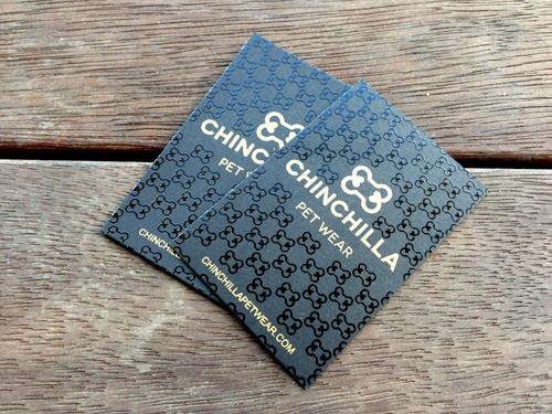
Company Logo Design for Chinchilla Pet Wear, a new high-fashion business producing quality designwears for our poochs!
The logo design a classic font to sit with other high-end designer brands with an emblem designed around a bone with two heart ends that is tiled into a pattern that appears across their product lines.http://duffy.co.nz/company-logo-design-chinchilla-pet-wear/
Design for Magento Commerce Membership web site Mummii.co.nz
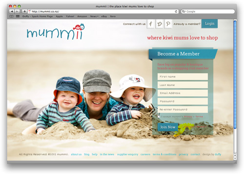
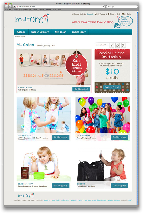
Design for Magento Commerce Membership Site Mummii.co.nz by Duffy.
The long awaited launch of the Mummii happened last week! An exclusive membership online ECommerce store for Kiwi mums.
Duffy created the branding and the Magento custom design for the website. Duffy designed each page of the site and all the custom icons throughout.
The branding playing on the two ‘i’s of Mummii being a boy and girl.
“We engaged Belinda to work with us to transform our vision into a tangible brand and identity for our business. Her insight and ability to live our vision with us, resulted in the development of a brand that was personal yet professional, imbued with our values, and creates the emotional connection with our customers that is crucial to the success of our business. We continue to work with Belinda as our brand, a living entity for our business, continues to evolve.”
Kara Fleming, Director, Mummii
http://duffy.co.nz/design-for-magento-commerce-membership-web-site-mummii-co-nz/
Shopping Mall Branding – The Food Pavilion – Manukau Supa Centa
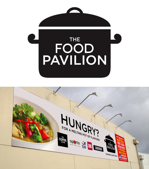
Shopping Mall Branding for the new Food Pavilion at Manukau Supa Centa.
Duffy created a new identity for the Manukau Supa Centa eatery, the brief to create an identity that reflected the melting pot of flavours at the Pavilion. Duffy also created the campaign graphics for the Flava of Manukau best recipe competition.http://duffy.co.nz/shopping-mall-branding-the-food-pavilion-manukau-supa-centa/
Wayfinding Signage Design – Manukau Supa Centre Food Pavilion
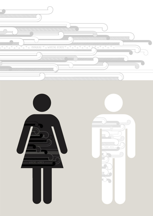
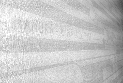
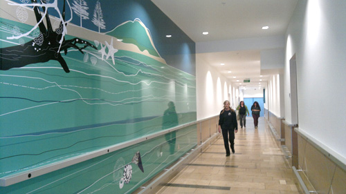
Wayfinding signage design for the amenities at the new Food Pavilion at Manukau Supa Centa has just been completed by Duffy Design.
The design comprising of a 7 metre custom wallpaper design based around a Maori inspired koru design, fused with typography themed around terms relating to Manukau and New Zealand.
This pattern was also applied to the Mens, Womens, Baby and Disabled icons.
Shop Branding & Window Graphics – The Rub Broadway Newmarket Auckland
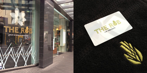
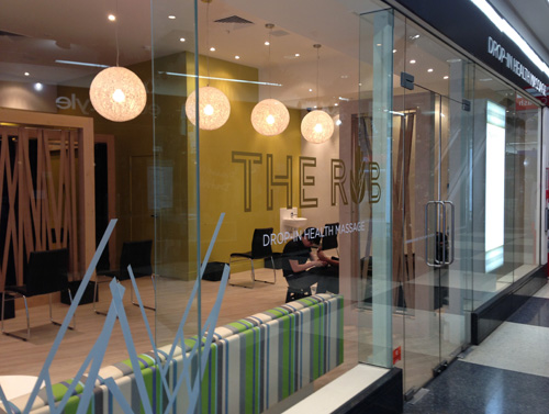
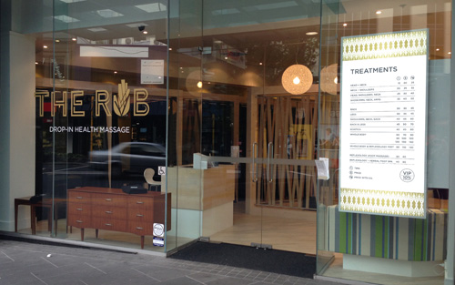
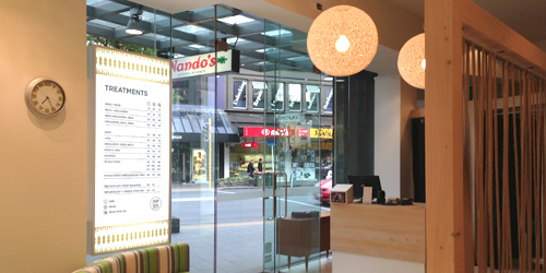
Shop branding and Window Graphics by Duffy for The Rub.
The Rub, a stunning new Drop-in Health Massage addition to Broadway, Newmarket.
Duffy designed the logo design, loyalty cards, lightboxes and window graphics. The brand identity, a fusion of a ‘tree’ design that was worked through from the Interior Design linking the woven hessian panels with the tree pattern on the windows, lightbox and in the hand shape in the ‘u’ of Rub. A fun project!
“Belinda understands the importance of retail branding in drawing customers in to our store.
She delivered a brand that was fresh and original, while incorporating well with our store fitout.
The brand, original pattern and graphic elements for our store windows and print material are fantastic. Above all they work for us everyday.” Chris Burt, Owner.
Wall Graphics – Bayfair Shopping Mall Tauranga
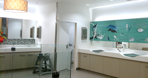
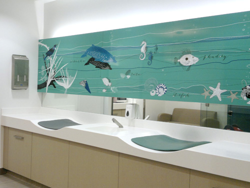
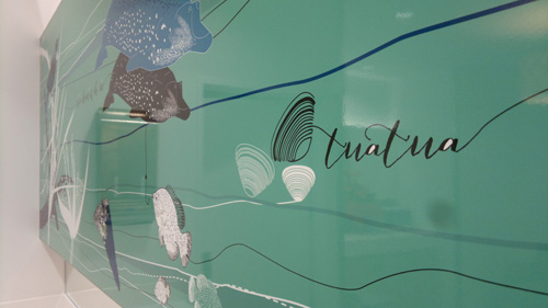
Duffy has just completed the custom designed wall graphics for the mural at the entrance to the Amenities and the custom wallpaper above the nappy change area inside the Parents Room at Bayfair Shopping Centre hot up on the walls last Tuesday!
“The parents’ room and amenities upgrade has set new standards in design in the region-Incorporating graphic’s that show case the regions iconic images, The new facilities are a refreshing addition to the Bayfair retail mix and show case innovative design that provides function, great aesthetics and unique sustainable green features. Since the opening the new facilities have been heavily used with continued positive feed back for the users on how great the facilities are” Steve Ellingford, Centre Manager, AMP Capital
Wayfinding Signage Design – Bayfair Shopping Mall Tauranga
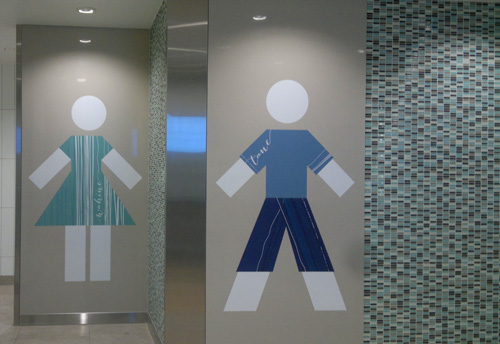
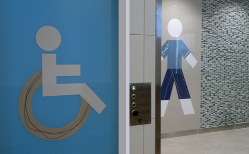
Duffy has just completed some the wayfinding signage for the Amenities and Parents Room at Bayfair Shopping Centre hot up on the walls last Tuesday!
“The parents’ room and amenities upgrade has set new standards in design in the region-Incorporating graphic’s that show case the regions iconic images, The new facilities are a refreshing addition to the Bayfair retail mix and show case innovative design that provides function, great aesthetics and unique sustainable green features. Since the opening the new facilities have been heavily used with continued positive feed back for the users on how great the facilities are” Steve Ellingford, Centre Manager, AMP Capital
Proposal Design – Auckland and Blues Rugby High Performance Centre
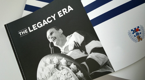
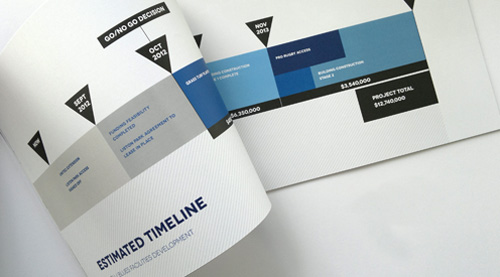
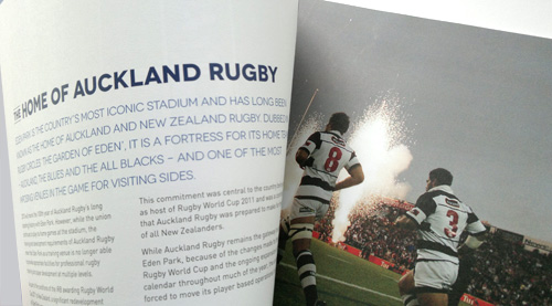
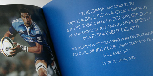
Duffy has just completed in 2 days in conjunction with fantastic writing by Boyd PR… This impressive proposal for Auckland and Blues Rugby for funding for a new High Performance Centre at Liston Park.
Postcard Book Design – The Boatshed Hotel
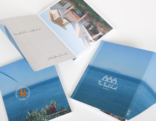
This custom postcard book design for The Boatshed, has a wrap-around ocean cover featuring the stunning view from The Boatshed. Inside are postcards featuring the hotel and great pics relating to the unique Waiheke experience – A beautiful giveaway for hotel guests.
New Website Design – The Mortgage Supply Co New Zealand
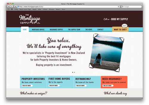
Duffy has just completed the new website design for The Mortgage Supply Co.
The site features custom illustrations by Duffy throughout to graphically communicate everything they do in a style that is uniquely theirs.
“Rebranding and relaunching my business would have been a far bigger task than it was without Belinda’s expertise. The best thing we did was bring Belinda in right at the start where we literally had just a blank piece of paper. Right from concept design to ensuring her web site design was produced the highest standards through the web site development process.
Belinda ensured that my dream for the brand became real. Her creative talents combined with an eye for detail has given us a look we are immensely proud of and one that our clients comment on over and over again.”
David Windler, Director, The Mortgage Supply Co.
Logo Design – The Mortgage Supply Company

Duffy was approached to create a new identity to move the former franchise owner of ‘Auckland Home Loans’ to a new brand that he would be proud of that truly reflected his innovative and progressive Mortgage and Insurance business.
Duffy engaged a Brand consultant to run several workshops to find a new brand name and brand essence that now is The Mortgage Supply Co.
“Rebranding and relaunching my business would have been a far bigger task than it was without Belinda’s expertise. The best thing we did was bring Belinda in right at the start where we literally had just a blank piece of paper. Right from concept design to ensuring her web site design was produced the highest standards through the web site development process.
Belinda ensured that my dream for the brand became real. Her creative talents combined with an eye for detail has given us a look we are immensely proud of and one that our clients comment on over and over again.”
David Windler, Director, The Mortgage Supply Co.
Invitations Design – Whale Custom Birthday Invitation
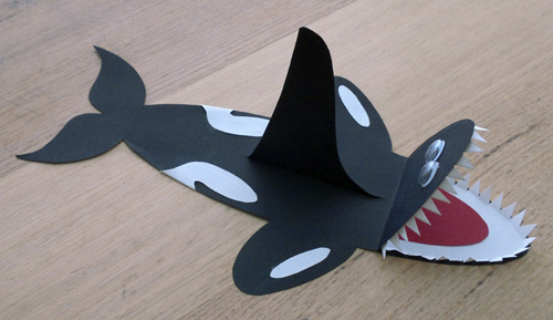
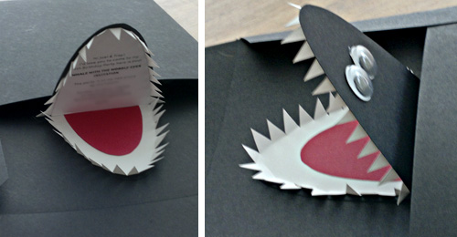
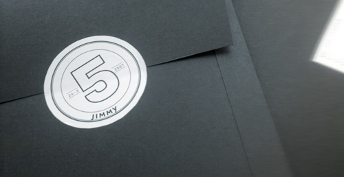
We had heaps of fun with this Whale Invitation Design for our youngest apprentice.
Each birthday invitation was custom made in the shape of a whale and inserted in a hand-made envelope too!
Auckland Philharmonia Orchestra – Online Christmas E Card
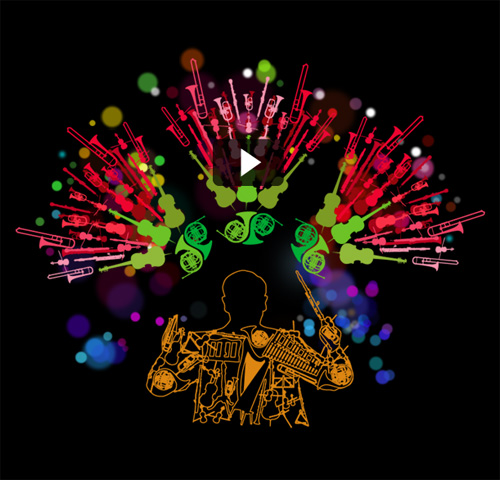
After the much loved Christmas Tree E-Card last year designed by Duffy, the Auckland Philharmonic Orchestra briefed Duffy to design another beautiful custom-designed Christmas Ecard for 2011 – this year based around the Pohutukawa.
Portfolio Website Design – Amber Carroll Makeup Artist
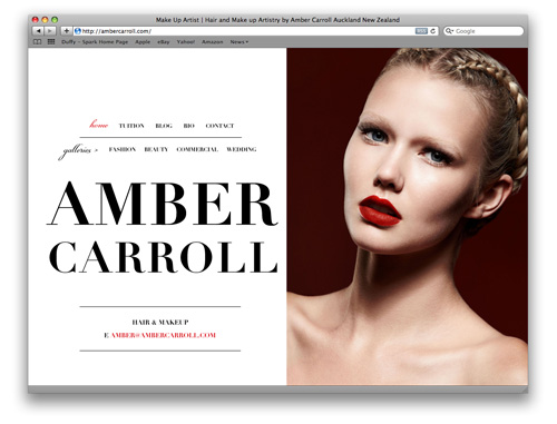
Duffy has just completed the portfolio website design for one of New Zealand’s leading Makeup Artists, Amber Carroll.
The design of the site is based on a ‘double-page spread’ layout, as the majority of Amber’s work is published in leading fashion magazines.
“I wasn’t 100% sure on what I wanted for my site in the beginning – I knew more of what I didn’t want. It was a process that evolved over time & Belinda was instrumental in bringing that to life.
I felt like she listened & interpreted my ideas fantastically. Belinda was excellent to deal with & I am really happy with the site & how it all looks.” Amber Carroll
Cafe Design – With a Graphic Edge – Nuffield Street Cafe
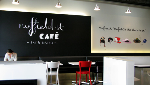
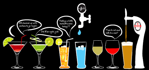
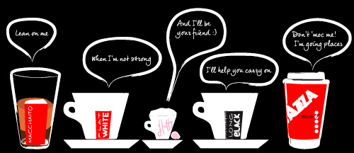
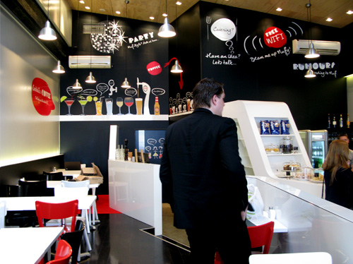
A Cafe Design with a Graphic Designers touch!
Duffy has been working alongside Paul Izzard Design to create interior graphics and a suite of marketing material for the newly refurbished Nuffield Street Cafe. With a blank canvas of walls, Duffy created an environment ‘to be’, where everything on the walls comes to life with a ‘drinks line-up’ with a range of coffees and popular drinks ‘in conversation’, a range of hats that visitors can ‘wear’ and a quirky range of menu board graphics too.
A cafe with nothing left untouched by Duffy, VIP & coffee cards, menus, flyers, signage – all creating a vibrant image rich brand that is the Nuffield Street Cafe!
Cafe Logo Design – Nuffield Street Cafe, Newmarket, Auckland
Hot off the Duffy press the cafe logo design for the Nuffield Street Cafe in Newmarket, formally the Olive Cafe.
Label Designer for Blanchett Skincare 'Oil of the Olive' Face Collection
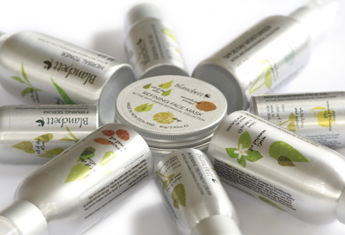
Duffy has just completed the new label designs for Blanchetts ‘Oil of the Olive’ Anti-Aging Botanical Face Collection.
Another ‘clean’ design by Duffy – Featuring oil droplets and illustrations of the key ingredients in each highly effective formulation, varying on each bottle design to highlight the plant oils, extracts and essential oils used.
An exciting new look for Blanchett, a New Zealand family skincare company based in Matakana with a family commitment to ‘Beautiful skin… Naturally’.
“As a designer (Architectural) myself, and having had a lot of involvement in
our ‘look’ so far, it is with a bit of caution that you search out a
professional to take you to the next level in design for your brand.
Finding Belinda has been wonderful, she is so creative and knows her tools
of trade well, listened carefully to hear to what we were looking for and
delivered a ‘look’ we just love. She’s not just a great designer but has
become part of our team in the way she shows enthusiasm for what we are
doing and makes helpful suggestions when she sees something which can be
improved, even the little things which really do make a difference. I look
forward to her design involvement in our company as we move forward.”
Jenny Blanchett-Burton, Director, Blanchett
Business Cards Business Cards
Business Cards Business Cards from Duffy Design on Vimeo.
They come into our hands same old same old business cards…
Bevin Wong commissioned Duffy Design to design a business card that broke through the ‘same old business card mould’, the solution a card that stands proud pushing its way out of its flat surface to surprise the receiver and truly make an impression.
“Belinda has been the consummate professional in all her dealings with me.
She had to produce a business card that was memorable and communicated the correct professional message to potential clients, all within a very tight timeframe. She has succeeded on all fronts, the result is a card that people have brought smiles to people and in a number of instances, contacts who have stopped to examine and play with the puzzle, which is the desired memorable effect. Well done Belinda, and thanks for the brilliant work! Bevin Wong.”
Website Redesign – Osmosis Skincare New Zealand
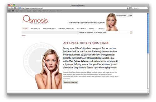
The makeover by Duffy Osmosis New Zealand needed to align its brand online as the world’s best skincare products fastly becoming a must-have item in New Zealand’s fashion and beauty industry.
A website redesign transforming the site into a clean sophisticated minimal look that Duffy as carried across a range of print and screen-based marketing collateral from instore posters to training powerpoint templates.
A challenging little site design to work with an ‘out of the box’ e-commerce website software, to allow them to easily update product and their entire site with ease.
This site also features a wholesale area where their clinics can pay their accounts, download files and many more great features. A site that really ‘works’ for them.
“Duffy Design is a long awaited and desperately needed player to Auckland’s design space.
This past November we incorporated our Osmosis Skin Care business from Colorado. For a few months Kay and I really struggled to find a local company that delivers the same level of excellence we were accustomed to in California.
Duffy may be a boutique operator but Belinda truly offers the same level of quality of “design intelligence” as any of her counterparts in LA.
Belinda has an amazing ability to take a crude concept and deliver true inspiration in a very short period of time.”
Jack Savas, Director, Osmosis Skin Care New Zealand.
Product label design for 'Yellow Diamonds' wonder pill
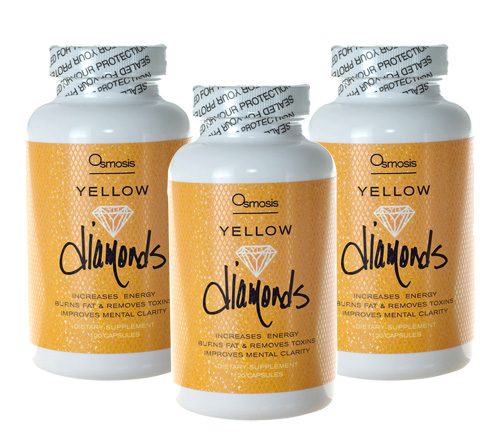
Duffy’s ‘designer label’ for Osmosis’s new yellow wonder pills, aptly named ‘Yellow Diamond’s, with inspiration from Ben Harper’s song, ‘Diamonds On The Inside’.
The bottle sticker design needed to look classy and sophisticated. The label uses a clear holographic foil that shimmers with particles like a diamond – a very cool bottle label design.
So what makes these pills wonderful? They contain a proprietary blend of beneficial nutrients that activate our cells to stimulate the production of adenosine triphosphate (ATP), the fuel for our metabolism and all cellular activity. Yellow Diamonds take free fatty acids (fat) and convert them into energy while allowing our adrenals to rest! Increasing energy, focus, metabolism, burning fat, removing toxins, lowering bad cholesterol, and curbing your appetite by stabilizing blood sugar.
“Duffy Design is a long awaited and desperately needed player to Auckland’s design space.
This past November we incorporated our Osmosis Skin Care business from Colorado. For a few months Kay and I really struggled to find a local company that delivers the same level of excellence we were accustomed to in California.
Duffy may be a boutique operator but Belinda truly offers the same level of quality of “design intelligence” as any of her counterparts in LA.
Belinda has an amazing ability to take a crude concept and deliver true inspiration in a very short period of time.”
Jack Savas, Director, Osmosis Skin Care New Zealand.
Interior Design Website Design – Alizarin
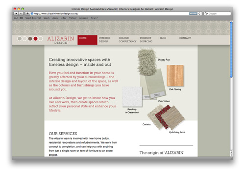
Hot off the Duffy cutting room table – a new website for Alizarin Interior Design.
The web design creative is based on the idea of fabric selvages, with each page of the site having it’s own unique colour scheme.
A true reflection of Ali Daniel from Alizarin’s prowess, developing colours schemes and interiors designed, from the benchtop to the roof colour all working in harmony.
“I approached Belinda Duffy of Duffy Design to design my new website after viewing her creative and diverse portfolio.
My brief to Belinda was for a visually appealing, informative and functional website. During our initial discussion she suggested using images as well as text to show how each aspect of the design process works, and also how colour and fabrics could be used as a repeating theme on each web page to reflect the nature of my business. These were both original ideas which evolved further as the website was developed.
Belinda communicated with me on a regular basis, ensuring that I was happy with each page design. Nothing was too much trouble – she was incredibly patient with all the minor tweaks and time required to get the web pages perfect before the site went live; never once losing her sense of humour! It has been a most rewarding journey to see the website come to fruition.
I am delighted with the end result which is a testament to her creative flair, attention to detail and professional approach.” Ali Daniell.
Logo and Website for Dece Design – Interior Designer Wanda Szychowska
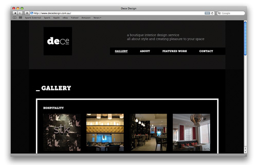
The Brief:
“I see my style as ‘edgy elegance’ and need this translated into a logo”
” ‘Dece’ stands for design that is edgy, contemporary (cool) and european.”
The result a strong graphic design across her cards and site that sits well with Wanda’s interior design style.
Hotel website design for The Boatshed – Waiheke Island, Auckland
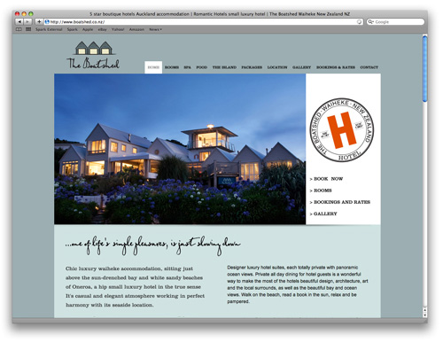
A fantastic new website for one of New Zealand’s best hotels and as featured in The Independent The Boatshed is officially one of the best six nautical hotels in the world.
This ‘new generation website’ ticks all the essential boxes:
– It is search-engine optimised by Duffy, coming up on Page1 of Google under numerous search terms of it’s competitors sites achieving higher rankings through strategic optimisation. The client has seen a significant increase in business with this optimisation.
– It displays well on an iPad and iPhone using code to have images changing out.
– It is impeccibly designed, with every page of the site uniquely designed, and implemented to pixel perfect ‘Duffy’ standards.
Designer Logo – Custom Design Logo for The Boatshed
A designer logo by Duffy for The Boatshed on Waiheke.
A much needed new brand identity to match the calibre of The Boatshed one of New Zealand’s best loved small luxury hotels.
The Ultimate Challenge: Designing an Elegant Site on Sex and Intimacy
The brief to Duffy:
“I want you to take us into another dimension of who we are, and I am confident, somehow, you are going to come up with the way to do this so that the mystical, poetic, esoteric side is not gone and hidden” Amara Charles
To find out more about this very interesting project…
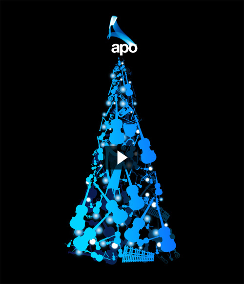
Auckland Philharmonic Orchestra – Online Xmas E-Card Design
Two months before Xmas The APO sent to Duffy:
20 Violins, 7 Violas, 8 Cellos, 5 Doubles Basses, 3 Flutes, 3 Oboes, 3 Clarinets, 3 Bassoons, 4 French Horns, 3 Trumpets, 3 Trombones, 1 Tuba, 1 Harp, 3 Percussion Instruments to compose into a stunning animated online Xmas tree!
“We have had so many comments from recipients saying how lovely it is and what a pleasure it was to receive.”
Helen Spoelstra, Auckland Philharmonic Orchestra.
Book Design – Saving Frances – Curing Cancer with Courage and Cord Blood
Hot of the Duffy Press:
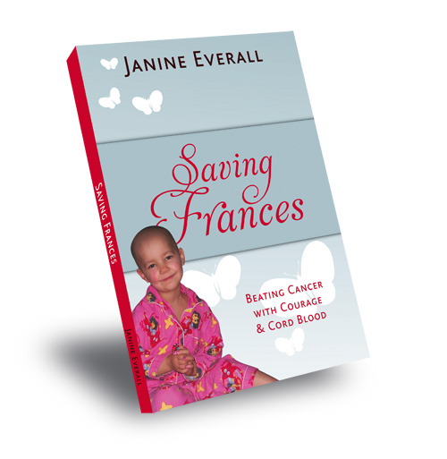
Book Design for Saving Frances – Curing Cancer with Courage and Cord Blood.
This job has been such a pleasure to work on!
I have learned so much about how incredibly amazing Cord Blood is…
You only have one chance to extract this precious Cord Blood at birth from the umbilical cord! I can’t believe we would through this precious ‘gold away’!!! CordBank provide the kit for the midwife to take the blood and they store it (Yes you can’t store it yourself in the freezer!! Have heard some very interesting stories from the girls at CordBank from people calling up asking whether they can ‘bring in’ their cord and placenta that they have had stored in their freezer – the answer – ah – no!)
Every baby’s cordblood is unique, it contains stem cells with that child’s very own DNA that when reinfused back into the child’s body throughout our their lifetime acts like a reset button – resetting the body back to full working order.
Cord Blood has been proven to cure Cancer, Cerebral Palsy, Type 1 Diabetes, Brain injuries. Current research shows that cord blood may play a part in the treatment of many other diseases and degenerative conditions including: Spinal Cord Injury, Heart Disease, Strokes, Multiple Sclerosis, Liver Disease, Parkinsons Disease!!
Wow!
Here is Frances Story:
The book can be purchased as a paperback or as an e-book from www.cordbank.co.nz
“We would definitely recommend working with Belinda. She is efficient, full of good ideas, works to deadlines and also really lovely to work with. If you’re looking for a fresh approach to your design requirements, give Belinda a call.”
Kate Carter, Cordbank New Zealand
Logo Designer for New Zealand Cord Blood Foundation

Duffy has just completed a lovely new logo design for the not-for-profit organisation ‘New Zealand Cord Blood Foundation’.
The design combining the shape of DNA and a baby’s umbilical cord formed into a shape of a butterfly, to reflect the amazing gift of life and sense of freedom and survival cord blood gives to those who’s lifes it saves.
Wordle Pictures – For Kids' Rooms Windows
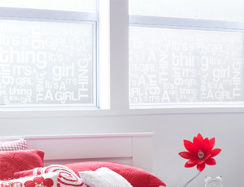
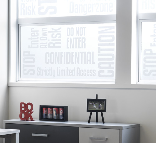
Duffy has been busy designing Wordle pictures for the kids’ rooms windows instore at Kidzspace’s new Takapuna store.
Yes – Kidzspace are now on the Shore!
A nice idea to filter light and bring some kids’ language into their rooms!!
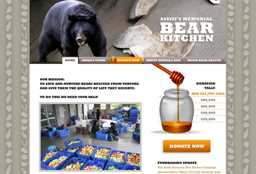
Assisi's Memorial Bear Kitchen Website Design
Duffy has just completed the website design for Assisi’s Memorial Bear Kitchen to assist helping build a kitchen to prepare food for the Moon Bears that are rescued from Bear Bile farms in China.
A very, very worthy cause. They need just another $73,000 for the kitchen, in conjunction with the SPCA us kiwi’s are on a mission to gather funds for the kitchen.
I went along to recently to hear Jill Robinson, the lady behind Animals Asia, who is making it all happen, and things are really changing over in China to close down these farms. So that is great news!
Bear bile has been used in traditional Chinese medicine for hundreds of years and has resulted in thousands of bear farms in Asia where bears spend their lives in cages barely large enough for them to move in where they’re milked for their bile through a catheter, or a permanent hole in the abdomen that bile drips out of.
There are officially about 7,000 bear farms in China, but groups suspect the actual number to be higher. The World Society for the Protection of Animals estimates that approximately 12,000 bears are currently suffering on bear farms around Asia, with an estimated 16,000 left in the wild, who are considered an endangered species.
The active ingredient in bear bile, UDCA, can be synthetically created without the use of animals. Additionally, a report by the Chinese Association of Medicine and Philosophy and EarthCare has established that there are at least 54 herbal alternatives to bear bile, including Chinese ivy stem, dandelion, chrysanthemum, common sage and rhubarb. The alternatives are both cheap and effective, according to Animals Asia.
Animals Asia have a great number of doctors and a huge amount of extensive research to prove that the bears that the bile has been extracted from have and die from liver cancer, so any product often non-essential, non-TCM products such as toothpaste, wine, shampoo and power drinks, that contains Bear Bile can make humans get liver cancer too, need I say more…
Business Web Site Design for Carroll's Transport Warehousing & Logistics Auckland
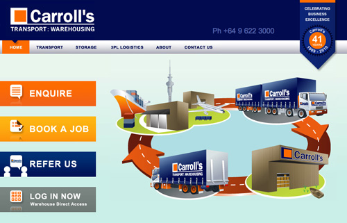
Duffy has just completed the website design for one of Auckland’s leading businesses in the Transport Warehousing and 3rd Party Logistics industry Carroll’s.
The design objective:
– To communicate the history of Carroll’s, a family business with an outstanding reputation
– To let the staff ‘speak’ about their ‘love for their jobs’, hence why they have been with the Carroll’s for decades.
– Use pictures to visually communicate ‘what they do’ in an interesting way (‘Pictures say 1000 words‘)
– Highlight the ease of working with Carroll’s, that working with Carroll’s is ‘easy’, ‘they go the extra mile’, because working with Carroll’s you are working with and are part of a ‘family’.
“Duffy Design was referred to me by two other companies we have dealings with. Belinda has just completed our new website and I cannot speak highly enough of her. The end result is exactly what we were looking for. We are a Transport Warehousing Company and when we started on this project we knew the direction and feel we wanted. Belinda clearly listened, she went about understanding what we do, how we do it and why we are different. I feel this was the key and coupled with her great design ability, we received a website that doesn’t look like it has come off a factory production line. Belinda thankyou for all your patience with me.”
Chris Carroll
Custom Web Site Design – Self Drive Holidays New Zealand
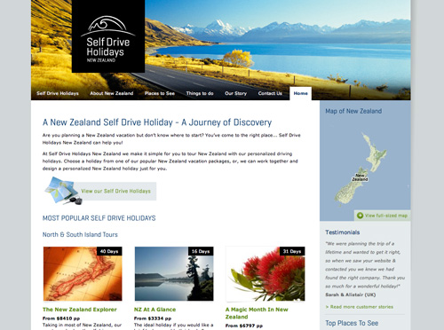
Duffy has just completed the website for Self Drive Holidays New Zealand.
“Belinda Duffy has been fantastic to deal with right from the start. She has designed & project managed our website www.selfdriveholidaysnz.com along with the branding for our stationery. She has thought outside the square to come up with a professional, fresh & easy way for people to have their holidays arranged for them. Her knowledge on all things design and web related is incredible.
Belinda has a fantastic eye for detail and has been great to deal with by email, phone and in person. She really wants to see her clients succeed which is fantastic. Thanks Belinda!”
Cam Potts, Founder, Self Drive Holidays New Zealand
A year-long project complete!
This project utilised the whole toolkit of services we offer at Duffy.
Keyword Research for online companies:
It was really important for this business to have a great domain name ‘packed’ with keyword clients search for to find ‘Self-Drive Holidays’. In-depth keyword research was done to see what US, UK and Australians search for to find ‘Self Drive Holidays’.
From this research the domain name www.selfdriveholidaysnz.com was chosen as it cleverly contains several search terms. We also recommended an abbreviated name also www.sdhnz.com for ease of people typing in the domain name.
Branding:
Duffy created the branding for SDHNZ based a stylised steering wheel, that reads cleverly also as a mountain range and koru design. The brand was simply executed in Black and White (a key NZ palette) to ‘stand off’ the stunning images sitting behind it on the website and print collateral.
Website Strategy + Design:
This website was no ‘walk in the park’ project! The site is all custom designed page by page and custom-coded.
Duffy doesn’t use ‘out-of-the-box’ CMS (content management systems), sites like this and the majority of large sites we work on – they just don’t fit the mould. So we make the mould to fit the site.
This site cleverly holds all the ‘Things to Do’ and ‘Places to See’ in a database, allowing the client to create custom holidays that detect when he chooses a region a selection of things and places to see so creating holidays for him is easy.
We also used Google maps and coordinateas to automatically build this holiday maps.
The result a very clever website that works for the client, that he has total control of moving forward.
Double Award-winning Business Card Design by Duffy
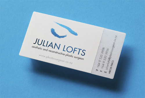
Designed by Duffy Design – Plastic Business Cards for Julian Lofts, Auckland Plastic Surgeon has won 2 Pride in Print awards!! Best in Business Print and Best in Screen Print.
“A job that looks simplistic yet it is highly complex, and taken a great deal of skill to bring all the elements together and have a job that matches up perfectly.”
“Very fine detail well executed in screen and on thick substrate, great planning and perfect job.”
Branding the future of postal mail – Automail
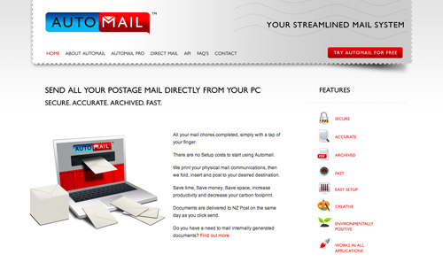
Duffy has just completed the brand development for Automail.
Automail is an online postal mail service enabling businesses to ‘click to print and post’ direct from their desktop all of their business mail and have it delivered within 24hrs.
Automail also has an online portal ‘Automail Direct’ to businesses to send bulk direct postal mail campaigns.
Duffy – Custom Web Site Designer for Access Pacific based in Auckland New Zealand
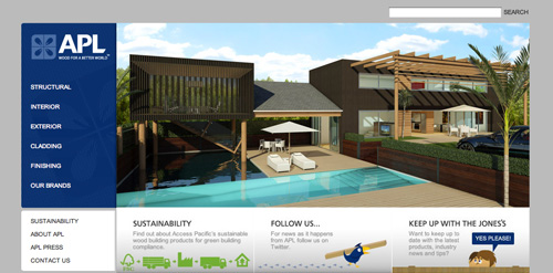
The new website design for Access Pacific New Zealand’s leading sustainable wood products company is now live!
Duffy designed the entire site opening with an interactive house allowing customers to see the range of applications Access Pacific products can be used for in building.
Duffy based in Auckland, New Zealand specialist custom web site designer for high profile New Zealand businesses.
Identity Design for Verdo Nails Parnell Auckland
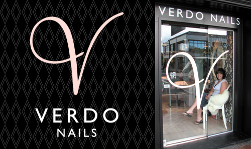
Duffy has just created the new identity design for the former Parnell Nail Studio now Verdo Nails on Parnell Road, Auckland.
Duffy created the logo design, stationery (appointment cards, pricelists, gift vouchers and exterior signage). The outcome a brand, that truly lives up to its reputation as being Auckland’s best nail studio.
Well done Amber, you have done a stunning job.
Interior Design by Wanda Szychowska – Dece Design
Cake Boutique Logo Design – La Couronne Auckland
Duffy has just completed the branding, logo design, stationery, website design and stunning exterior signage for a stunning cake boutique recently opened at 5C Lorne St, Auckland City.
Interior Design Paul Izzard Design
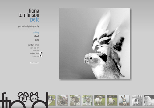
Photography Website Design for Pet Photographer Fiona Tomlinson
Duffy has just completed the website for Fiona Tomlinson Pet Photographer in Auckland.
Duffy also designed her much loved cute little logo using the cat and dog combined with the ‘ftp’ initials.
With 15 years for experience of shooting every celebrity under the sun and kids kids kids, weddings, weddings, weddings! Fiona is now moving her passion for ‘capturing that real essence’ of personality, to our fluffy, hairy and feathery pet family members.
Very exciting!
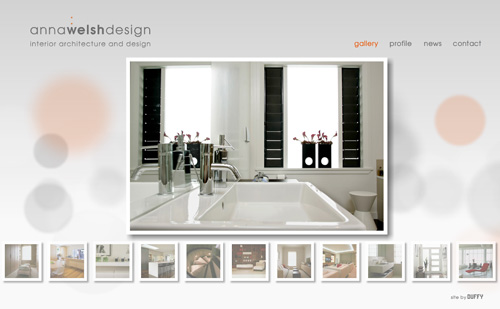
Custom Website Design for Auckland Interior Designer Anna Welsh
A custom website design by Duffy featuring a stunning showcase of interiors by leading Auckland Interior Designer, Anna Welsh.
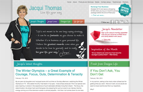
Duffy – WordPress Blog Designer for Jacqui Thomas Website
Duffy specializing in custom WordPress theme design was commissioned as a blog designer to create the website for Jacqui Thomas leading Auckland Life Coach & Author of ‘Go Girl Go’.
Jacqui, thanks heaps for your post about working with me:
http://www.jacquithomas.com/loves/belinda-duffy-duffy-design
Cafe Logo Design – Teed Street Larder, Newmarket Auckland
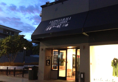
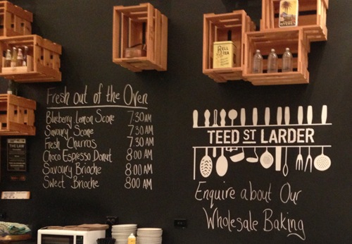
Duffy has just finished the cafe logo design and branding for the Teed Street Larder in Newmarket, formally Columbus Coffee.
Interior Design by Paul Izzard Design.
Christmas E Cards : Online Christmas Cards save time and money!
Only 12 weeks till Christmas – time to get those creative juices flowing on Christmas Card ideas.
Duffy created for Peddlethorp Architects, based in Auckland, New Zealand a custom Merry Christmas card using a video that linked from an email they sent to all of their clients.
An innovative idea – as everyone loves watching videos.
No more getting staff to sign loads of Xmas cards, paying 50cents postage, printing, paying a staff member to address them and so it goes on…
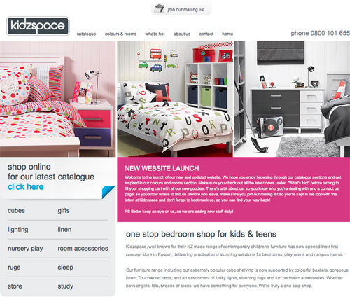
Duffy – Web Site Designer for new Kidzspace Furniture Web Site
The web site design new for Kidzspace, award-winning kids furniture store in Auckland is now live, designed by Duffy.
To design a web site for Kidzspace that aligns so nicely with their quality kids furniture and incredible selection of designer kids products was a very rewarding job. So nice to have the website, print and advertising design we do for Kidzspace also, all in synergy now.
Check out the new Duffy designer web site design for Kidzspace at:
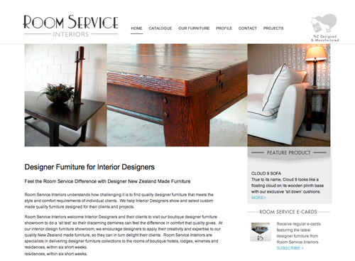
Interior Design Furniture Web Site Design for Room Service Interiors
Hot off the press – The Room Service Interiors web site design, by web site designer Duffy.
Room Service Interiors, specialists furniture designers of classic high quality New Zealand made furniture for Interior Designers.
Room Service Interiors are based in Newmarket Auckland.

